
INTRODUCTION
This page consists of textual analyses for an existing teaser trailer, horror poster and horror magazine. These will show research on the different aspects of each element such as camera angles, mise en scene etc. for the teaser trailers. The use of lighting, costume, NVC etc. for the posters and the use of mastheads, a main image and cover lines etc. for the magazines. We will cover the research on the general conventions of the three as we will put them into practise when designing our final products.
TEASER TRAILER - TEXTUAL ANALYSIS
Title: Inbred
Inbred is a 2011 British film about youth workers and young offenders, who come across an eerie Yorkshire town with a lot of hidden, dark secrets.
Although the trailer is quite short, over 76 shots were used, with the majority of them being in quick succession. This quick sequence of cuts meant that it created a pacey, thrilling atmosphere about the trailer. It also connotes how fast paced the film is to the audience which could encourage them to watch it more. In the trailer, more mid-shots are used than anything and usually in the same frame, weapons are being brandished and so the reason for this is to show everything in the scene. Close ups are also used to illustrate the fear in the character’s face, and in turn connotes the fearfulness the audience will feel once they experience the film.
The mise en scene is especially important in ensuring the film has the right fear factor about it. An establishing shot is used in the beginning to depict the countryside setting in which the film is set; this would be interpreted by the audience as a place which is unusual for a horror. This would in turn generate an idea of the film being abnormal and thus creates a fear of difference for the audience. This is also backed up by the use of high key lighting, as normally a horror film would be very dark and so by conforming against stereotypes, it creates a more suspenseful theme to the theme. Also, the costume works well in bringing about normality, since the attire of the characters are everyday clothes. This connotes the idea that “normal” everyday people can be put in these situations which are extremely dangerous, and so it creates a synthetic personalization with the audience, as they feel they can relate. Props used include bats and chainsaws, and these props are especially useful in generating excitement for the audience.
Knowing that the characters can defend themselves against attackers, the audience are aroused with a sense of elation that with the use of dangerous weapons they can survive. Potentially hazardous weapons such as bats and chainsaws can also connote the idea of living life on the edge and ultimately it evokes a great excitement about the film. NVC is used effectively in the trailer to demonstrate fear about the situation they’re in. It works with close ups as horror and fright are shown on the character’s faces which would be reflected in the audience as they feel the fear of the character. This ultimately builds the audience to side with the characters through the NVC, as they feel like they can relate to the character.
Diegetic sounds such as gunshots, screams and slashing are used so that the audience can get a more authentic look at the film. It also creates excitement as these sounds are not heard every day and so it gives the audience a thrilling feel about the film. Non-diegetic sound such as the incidental music also works well in creating elation in the audience, as evident in the trailer, the score is pacey, tense and eerie. Ultimately this evokes a great sense of fearfulness, excitement and in general thrilling for the audience.
Title: Paranormal Activity 4
Year of Release: 17th October 2012
Director: Henry Joost & Ariel Schulman
Production/ Finance Company:
- Blumhouse Productions
- Paramount Pictures
- Solana Films
- Room 101
Principle Cast:
- Katie Featherston = Katie
- Kathryn Newton = Alex
- Matt Shively = Ben
- Alexondra Lee = Holly
- Stephen Dunham = Doug
- Aiden Lovekamp = Wyatt
- Brendon Eggertsen – Derek
- Sara Mornell = Debbie
- William Juan Prito = Hunter
- Brady Allen = Robbie
Films Origin: Paranormal Activity 4 is the part of the Paranormal Activity franchise and is the 4th and most current film in the franchise.
Synopsis: The story takes place in the year 2011 and picks up 5years after the 2nd film in the franchise following the events of Katie killing her boyfriend Micah, Sister Kristi and her sisters husband Daniel before taking their baby names Hunter. This film focuses on Katie moving with her “son” next door to a young girl named Alex and her family where Alex begins to experience odd occurrences in her home which is then taped with surveillance camera’s and her laptop camera. Alex associates this with Katie’s son who has moved in with them for a while as his mother is in hospital. The strange occurrences increase and the young boy begin to do weird things to Alex’s younger brother. Where he is then being called hunter as he was adopted into the family 5years before and is drawn to the neighbours house where Alex meets her death at the hand of witches/demons.
Information from: http://www.imdb.com/title/tt2109184/
This trailer is completely filmed with an amateur camera of some sort alternating between that of a hand held, surveillance and a laptop camera. The people featured in the trailer are all wearing ordinary clothing as if it was a natural setting which they are obviously trying to achieve even having the location in a middle class home in the suburbs. The trailer begins with quick shots from a home video which is sweet and homely which then quickly turns to destructive and scary surveillance tape clips each taken from the previous films ‘Paranormal Activity’ Films. After the trailer quickly goes into a calm setting of the family they are currently looking at which looks completely unrelated to the previous footage a young girl is simply discussing the weirdness of her neighbour to a friend on webcam as well as her mother before strange things begin to happen. This trailer has quite a fragmented narrative with slight similarities which you can quickly identify with such as from the surveillance footage in the beginning of the woman taking the baby to end where the woman is now taking a child. The film clearly identifies that the young boy is weird and strange and so is his family and the teenage girl is the only person who is able to see and recognise this.
The pace of the trailer is quite quick it has slow moments which always pick up quickly with a score playing throughout, the score mirrors the pace of the trailer and builds and creates tension often. Most of the shots from this film are wide and reaction shots which set the scene for the snippet of what is about to occur.
As the trailer draws to an end the title of the film ‘Paranormal Activity 4’ comes on to the screen with the 4 quickly changing into a pentagram before changing back into the number, this is significant because if you have previously seen the 3 films before the sign is in each of them. This sign also has a subliminal feel to it as the pentagram is often associated with devil worship and evil. After the film title as the score is winding down the words ‘What really happened?’ appears on screen which draws in the audience who both have and have not seen the previous films because they want to know what happened to the girl and who that boy is.
Film Title: Saw VI
Year of Release: 2009
Director: Kevin Greutert
Production/ Financing Company:
- Twisted Pictures
Principle Cast:
- Tobin Bell
- Costas Mandylor
- Mark Rolstan
Films Origin: This is the sixth sequel to the 'Saw franchise'
Saw VI was released by Twisted Pictures in October 2009 and followed the success of the previous five films. It is believed that this is the last of the series of films however the ending has been left open for further films if decided. The Saw films are about the torture of people who have “done wrong” and Jigsaw gives them choices and decisions to make about other peoples’ fate and makes them fight for their own lives. The trailer is very short lasting 0.50, but gives the audience enough information without giving away the ending.
Content
- The film trailer contains the basic storyline and introduces the main characters.
- Title screens help the narrative as well as a voice over from the main character, Jigsaw.
- Title screens are also used for the film title, release date and official website.
Narrative Structure
The voiceover helps the narrative structure; it starts by explaining the situation and then goes on to further explain the problem which occurs from the situation. As the problem is explained further, the pace of the editing increases to create greater suspense.
The pace of the last part of the trailer gets even faster and the music stronger, but the resolution is not revealed.
Sound
- Diegetic sound- Dialogue from the film is used as a voice over. Other dialogue from the film is used to create panic and fear.
- Non-diegetic sound- the films soundtrack is used in the second half of the trailer.
- Sound effects are used in between the title screens as clips from the film are shown.
- A voiceover is used to introduce the name of the film and its release date.
Editing
- The pace of the editing picks up throughout the trailer and is very quick at the end, showing a montage of very brief/ quick shots.
- There are some very sharp cuts, fades and some of the shots flicker between each other.
Camera Shots
- There are lots of close ups to show emotion.
- Low and high angle shots are also used to show certain characters as dominant and others as inferior.
Mise-en-scene
- The Mise-en-scene in the trailer demonstrates that the film is set in an abandoned warehouse with different tasks set up.
- All the shots used are dark and the colour red appears throughout to represent danger and blood.
- The Mise-en-scene helps reinforce the genre of the film so audiences know that it is a horror with lots of torture and gore.
Conventions
- Darkness
- Voiceover
- Dramatic/fast paced music, from the soundtrack
- Screaming
- Fast paced editing/montage
- Antagonist
- Suspense
- Name of film and release date with voiceover
- Title screens to help narrative
|
|
|
Film Title: Sorority Row
Year of Release: 2009
Director: Stewart Hendler
Production/Financing Company:
- E1 Entertainment
- Summit Entertainment
Principle Cast:
- Briana Evigan
- Leah Pipes
- Rumer Willis
- Jamie Chung
- Audrina Patridge
- Julian Morris
- Margo Harshman
- Matt Lanter
- Carrie Fisher
Film Origin: Remake of 1983 film The House On Sorority Row
Synopsis: One of the girls in the sorority, Sister Megan, discovers that her boyfriend has been cheating on her. With the help of her sorority sisters they decide to pull a prank on him by faking her Megan’s death while the two of them was making out. However, the boyfriend ends up actually killing her. The girls hides the body with the weapon of murder and decide to put the incident behind them – the movie follows the girls and Garrett, the boyfriend, as they try to survive for their life as a mysterious killer try to kill them which they believe is Megan.
Genre: The film is a slasher which is shown in the trailer through props – the weapons that are used by both protagonists & antagonist.
Narrative: There is no narrative in this trailer the story is told through actual dialogue from the film:
· “You cheat on one Theta, you cheat on every Theta”
· “That boy need to be taught a lesson”
· “Megan dead and we are all responsible”
· “If we all stick to the same story no-one will ever know”
· “Megan came back from the dead and now she wants to kill us”
These pieces of dialogue give us an idea on what to expect from the film as well as the storyline.
Location: From the very beginner of the trailer we are shown the location which is a college in America. From this shot we understand why the film is called “Sorority row”. In addition the dialogue in the trailer gives a idea on where the film takes place for example:
· “ I hope that as you girls go out into the world, that the thing in Theta Pi will help you to do the right thing”
· “You cheat on Theta, you cheat on every Theta”
· “Congratulations graduates”
Characters: The characters are portrayed as happy normal college students who enjoy partying, drinking and promiscuity which connotes that they know how to have a good time and that they are normal people making them relatable to certain audiences.
Pacing: The pace of the trailer starts of moderately medium pace connoting their fast paced partying life then it slow down when start they prank on Derek eventually moving on to a fact pace once the first person is killed connoting that everything is happening really fast.
On Screen Graphics/ Captions: At the beginning of this trailer the only on screen graphics is Summit entertainment logo until Megan’s fake death where a white serif font appears on a black screen. That keeps happening until the first death– which is where the font changes. When the captions appear from this point on they are slightly cracked, the first word has a blue glow to it and the first “o” in sentence is a Greek symbol which means Theta (Θ)
Editing & Post-Production (Special Effects): At the beginning there are a lot of fast cuts this is because of a two reasons:
· To go with the music
· Show the fast pace of their lives
However, once Derek is found cheating and the girls plan and take revenge - longer cuts are shown. When this is happens a slower tempo music is used a non-diegetic sound. There is no CGI used in the trailer.
Music & Other Sound Effects: The music in this trailer give the audience a rough idea on what the mood of the scene is going to be like therefore giving a slightly insight on what’s going to happen. Both upbeat and slow music is played in this trailer.
Comparison: The house on Sorority row has a much shorter trailer than sorority row – this made because of the different years they were released in. Unlike Sorority row, the house on sorority row has a narrative.
POSTER - TEXTUAL ANALYSIS
|
Title: A Nightmare On Elm Street
The “Nightmare On Elm Street” poster depicts the main antagonist of the film, Freddy Krueger, with his claws out using medium-close up shot. The idea of a medium-close up Freddy connotes to the audience that he is always close and this evokes a sense of fear. The focus of the image is also soft which portrays the idea of not really having a clear image of Freddy, which in turn creates fear amongst the audience as most audiences have a “fear of the unknown.” The mise en scene creates an especially terrifying aura about the poster as the props, lighting, costume, non-verbal communication and setting work well in drawing the audience in. The main prop in the poster is the use of Freddy’s claws for fingers. The idea of a signature weapon could prove thrilling to the audience, as it is dangerous and could provide some sort of ecstasy for them. Freddy’s costume is significant as it shows holes and tears in his jumper, which connotes to the audience the idea of ripping out normality. Since jumpers are quite ordinary, the use of Freddy’s torn up jumper and disfigured face show him as an outcast to society and a fearful figure as he presents a fear of the unknown. Low key lighting is used to create a dark atmosphere about the poster. As the poster is dark, it leaves the audience with their imagination and ultimately allows the audience to consume themselves with fear, as they cannot see much else from the poster. This is also evident with the setting as a clear background is not established and it is also quite difficult to distinguish Freddy’s clothing to the background. This connotes the idea of Freddy being everywhere, which again evokes fear amongst the audience as it gives off an impression of Freddy, that you cannot escape from him. The main antagonist, Freddy Krueger is shown smirking in the poster, which connotes a twisted evil about him. It also depicts Freddy as a psychopath, as it represents the idea of Freddy having a fulfilling enjoyment out of killing people. Colour plays a big part in creating a fearful aura about the poster. Although the poster is overall quite dark, bits of red can be made out from his jumper. The colour red represents blood, especially in a slasher horror film where the victims usually have a very bloody, messy death. Red could also connote passion and in this case, Freddy Krueger’s passion would be killing/mauling people as seen from his claws also in the poster. The anchorage helps to bring about further fear about the poster. The tag line “welcome to your new nightmare” is used just above the title. The idea of “welcome” to a “nightmare” is an oxymoron as the two things juxtapose each other In the same line. |

You would “welcome” someone to something inviting and warm, however, in this case it is a “nightmare” and the two things contradict each other, which creates a sense of excitement for the audience. You also has visible fingerprints and blotches of blood on it, which ultimately evokes fear into the audience and it also helps create an idea on what the film might actually be about.
|
|
Title: Sinister
Year of Release: 5th October 2012 Director: Scott Derrickson Production/ Finance Company: - Alliance Films - IM Global - Blumhouse Productions - Automatik Entertainment - Possessed Pictures Principle Cast: - Ethan Hawke = Ellison Oswalt - Juliet Rylance = Tracy Oswalt - Michael Hall D’Addario = Trevor Oswalt - Clare Foley = Ashley Oswalt - Fred Thompson = Sheriff - James Ransone = Deputy - Vincent D’Onofrio = Professor Jonas - Nick King = Bughuul / Mr. Boogie - Victoria Leigh = Stephanie Stevenson / Family Hanging Out Killer - Blake Mizrahi = Christopher Miller / Sleepy Time Killer - Cameron Ocasio = BBQ Killer - Ethan Haberfield =Pool Party Killer - Danielle Kotch = Lawn Work Killer Films Origin: Directed by Scott Derrickson and written by Derrickson and C.Robert Cargill Synopsis: Ellison Oswalt a true crime writer moves both himself and his family into a house where a murder has taken place without his family’s knowledge. He is researching into the case for his new book to aid his failing career; he soon finds a box in his attic containing ‘Snuff’ film footage which he then goes and watches. The films each depict a murder with the same common image or figure which Oswalt attempts to find out whom and what it is. Soon strange things begin to occur at the Oswalt residence which prompts Ellison to move out unaware that this will just speed up the process resulting in his and his family’s murder all except for one child in the family who is in actual fact the killer and is then taken by the mysterious figure into his underworld. Information from: http://www.imdb.com/title/tt1922777/ This poster is very simple in its presentation; it is a single wide shot image with a basic use of colouring. The image is a harsh one as all lines and details are very prominent, standing out to the audience and causing the basic colours to stand out even more against each other. The use of the different shades of grey to white give this poster a slight feeling of innocence which is tainted by something evil, this could in fact go along with the image of the child as a child is the embodiment of innocence but clearly something has tainted this and this is portrayed through the use of the grey colours on the peeling walls and the shiny clean floor. The young girl who is dressed in a simple beige pyjama set with her face unknown to the audience gives off a sense of innocence but also a very cautious feel as she is an un known child, this feeling is brought forward even more as you see that a dark red burgundy coloured substance is dripping from her hands forming a scary image as it drips down. |

The burgundy colour of what only can be described as blood as it drips down is clearly fresh as it’s the dark colour of blood when it comes out from a fresh deep wound, the colour brings a sense of panic to the audience as blood is never a good sign. What makes this image in blood even scarier and sets an even deeper grim and eerie mood to the poster is the caption it simply states ‘Once you see him, nothing can save you’ in a black san serif font which is also used for the title of the film but in a smaller size, this stands out against the pale grey and goes along with the unknown face formed in blood. The lighting used in this poster is quite bright, a trick to make the image look even harsher and have the colours stand out even further enhancing the set mood. This film does not have any well known, big named actors so the people who designed had opted to shun the use of putting the names of the actor on the poster but instead putting the produces. It clearly states that the producers of ‘Paranormal Activity’ and ‘Insidious’ which are both extremely well known and successful films who have also been able to create their own franchises this means that the audience can identify with the quality of the films previously produces and apply it to Sinister which would make them want to watch it. |
|
Film Title: Drag Me To Hell
Release Date: May 2009 Director: Sam Raimi Production/ Financing Company: Universal Pictures Principle Cast: Alison Lohman, Justin Long, Ruth Livier Synopsis: A loan officer who evicts an old woman from her home finds herself the recipient of a supernatural curse. Desperate, she turns to a seer to try and save her soul, while evil forces work to push her to a breaking point. Mise En Scene Lighting: The image has high-key lighting at the top half of the poster and becomes low-key as it gets lower towards the flames. This can represent the battle between 'Good vs Evil' with the Heavens above and Hell below. NVC: The subject in the image is showing a facial reaction of distress and fearfulness. She seems as if she is screaming and is represented as a victim or 'damsel in distress'. Setting: The setting surrounding the subject is outside of an isolated home whilst flames surround the lower half of her body. This displays the sense of danger in the atmosphere as there is nowhere safe to go. Costume: The costume worn by the subject is a smart blazer and a small necklace which is being grabbed by demonic hands. Props: there is no props shown in this poster indicating that the subject is a victim and is represented as vulnerable and in need of help. Typography: The title of the poster is 'DRAG ME TO HELL' which is bold and simple. this also looks slightly engraved indicating that it is becoming worn out. Tagline: The tagline says "Christine Brown has a good job, a great boyfriend, and a bright future. But in three days, she's going to hell." This tagline does not fit in with the typical conventions of a horror film tagline due to the fact that the tagline is very long. This makes the tagline seem ineffective as the target audience will be less likely to read it. |

Shot Size: This is a mid-shot which shows the top half of the subjects body.
Mood: The mood and atmosphere of the poster is dark and demonic through the use of flames and demon claws grabbing on to the subject. this gives it the effect of dragging the female subject down as if she is being taken to hell by force. meanwhile above here the light is brighter which indicates that she has fallen from good to evil possibly through actions she has taken. |
|
Film Title: Insidious
Year of Release: 2011 Director: James Wan Production/Financing Company: · Stage 6 Films · IM Global · Alliance Films · FilmDistrict Principle Cast: · Patrick Wilson · Rose Byrne · Barbara Hershey Film Origin/Info: Original Synopsis: The film centred on family who have just moved house when one of their children, Dalton, goes in to a sudden coma. The doctors have no ideas what wrong with him and move him back home in his comatose state. This is when the mother, Renai, starts noticing strange things around the house like voice of the baby monitor and bloody hand print on Dalton bed. Thinking that the house is haunted they move only for Renai to continue seeing these things. Eventually they call Elise who specializes in the investigation of paranormal activity and discover that Dalton is possessed and lost in the further world. He can only return if his father goes and get him. Mise En Scene Lighting: Low key lighting has been used which creates an evil and scary mood. Setting: The setting is outside a house on a stormy day however a lot of this poster looks Photoshop which makes me think that the boy’s photo might have been taken in a studio. Props: There are no props used in this poster NVC (Non Verbal Communication): The boy in the poster has a neutral facial expression creating a mysterious feel to the poster however, his eyes gives off a scary feel. Costume: The costume for this character is red and blue checker pyjamas. Shot Size: The shot that has been used for this poster is medium shot. Main Image/Composition/Layout: The main image of this poster is the boy – the face over the boy is really dark this could be because of the lighting or make up. |

Both of the boy’s eyes seem to be abnormal this may have been created through Photoshop or by the boy wearing contacts either way it’s gives the effect that that the boy is possessed.
Credits: The credits are placed towards the bottom middle of the poster and is the colour white. Tagline: “It’s not the house that haunted” – the tagline of this poster is very small and is place underneath the title and is the colour white. The tagline with the picture tells you right away that it is the boy that is possessed. Fonts/Name: None of the cast name is mention on the poster however; previous films that company have made are mentioned. “From the markers of Paranormal Activity and Saw” this effectively bring the fans/audience who enjoyed these two films to watch insidious because it’s most likely to be scary just like the others. |
MAGAZINE - TEXTUAL ANALYSIS
|
Title: HorrorHound
SCRE4M is a 2011 slasher horror depicting a masked murderer (Ghostface) committing several brutal murders and mutilations. The movie poster uses a medium-close up of the main antagonist and in the same frame; he is shown brandishing a knife. The idea of him being quite close up connotes that he is always near you, which would arouse a sense of fear and hysteria for the audience. The main image is of Ghostface; and the composition of the antagonist creates an interpretation of him conforming against normality as he is leaning slightly to the side. For the audience this would create a sense of fear as he is not what they consider “normal” and ultimately creates a fear of the different. The mise en scene of the magazine cover is important as it creates a generic horror effect to the cover. High key lighting is used for the front cover which normally would conform against a typical horror magazine cover, since they usually use low key lighting. The use of high key lighting connotes the idea of abnormality about the horror film which could persuade the audience to take more of an interest towards it. The non-verbal communication (NVC) works well with the props aspect of mise en scene as the main antagonist, Ghostface, is brandishing a knife. His NVC portrays the recklessness of the antagonist and this evokes fear amongst the audience as it shows almost as if he is ready to attack them. The use of a knife creates excitement for the audience, as the idea of a dangerous weapon creates an exciting aura about the film and so it ultimately creates a thrilling tension about the killer. The costume is also effective in creating fearfulness for the audience as it depicts a dark hooded cloak. This connotes a mystery about the antagonist and evokes a fear of the unknown for the audience, as they leave the identity of the antagonist to their imagination which is a lot more terrifying than someone else’s imagination. The setting is not clear but it is made out to be a fiery background. The idea of using fire evokes excitement for the audience as it is dangerous and can almost be out of control sometimes. Fire also connotes passion and a further look into the character (wielding a knife), would arouse feelings that the antagonist has a passion for killing, as suggested by his NVC, the props and the setting. The typography normally plays a very big part in creating a good horror effect for a poster. In this case, the font stays true to its previous titles as it is similar to the other three instalments of the film. |

The font used for the title looks modern and this could evoke fear for the audience, as it’s almost as if it is all happening right at that moment and could happen to them. The style is quite pop-arty and so this could connote the idea of a serial killer who may find it amusing, or almost “child’s play” mauling and murdering people. This is further backed up by the high key lighting used, as it is child-like and this would conform against stereotypical horror posters which in turn could actually generate a larger fear factor.
|
|
This magazine is called ‘Fangoria’ is had a distinctive masthead which is almost as if it has created its own bubble for itself to be enclosed in, with the ‘F’ and ‘A’ in a serif font which is almost gothic but still quite modern, the ‘F’ and ‘A’ are pointing towards each other with great sharp lines throughout the text. This magazine does not appear to have a date and month of publication but instead an issue number ‘302’ along the ‘F’ of the masthead vertically.
The main image of the front cover is medium close up of an old haggish woman wearing an old fashioned black veil, with big grey hair and a red candle in front her face illuminating her ghastly features making her eyes become black hollow pits and her wrinkles stand out. This image is a dark one which shows nothing of light or anything good but simple evil. Underneath the main image is 4 other images one being a highly identifiable screen shot from the ‘Scream’ movies the others not so much but each one has a common theme of blood or gore somewhere in the image. The main cover line is ‘Insidious’ which must refer to the main image, I assume that at the time of release of this magazine the insidious film was either due to come out or was newly released, the cover has miner cover lines such as ‘Scream 4’ and ‘Blood for Dracula’, the cover lines are extremely simple as is the rest of the cover. What stands out the most and I believe is the selling line is the text just above the masthead which says ‘Italian Horror, American Terror and German Gore’ I believe this has been done to appeal to a wide audience I also believe that this is why the cover is so simple so it can be looked at and understood by many. Photo from: http://weimarworld.blogspot.co.uk/2011/02/fangoria-becomes-posterchild-for-print.html |

|
|
Masthead: The masthead "Scream" is displayed at the top of the page as it follows the standard convention of a magazine. The font is bold and displays blood dripping from the text giving it a gory effect. This allows it to easily be distinguished as a horror magazine with the use of the blood effect on the font and the name "Scream" can be seen to connote fear indicating to the horror genre. In addition to this the font colour is red which reinforces the idea of blood being used to symbolize death.
Date-line: The date-line is displayed inside the bar code on the bottom right corner. The date of "May/ June 13" is indicated as less significant due to the size of the text being very small and almost hidden from view. However, the issue of the magazine is revealed as "Issue 17" and can be seen as a replacement for the date-line. Main Image: The main image of this magazine is of the antagonist from the popular horror film "Evil Dead". The daunting image of a pale female face and hand surrounded by a chain instantaneously catches the readers eyes. In addition to this the subject in the image is staring directly at the camera. This gives the image the illusion that the subject is staring at you and follows you. This allows the image to become more effective as it is engaging to the target audience and promotes sales. Main Cover-line: The main cover-line is "EVIL DEAD Interview Special." Cover-lines: All the cover-lines are on the left hand side of the page and beneath the masthead. They consist of the colour scheme yellow and white which conforms to the colour scheme of the magazine. They also conform to the general conventions of a horror magazine with the titles such as "STALK 'N SLASH" or "The Silent Hill: Revelation 3D Interview." Left Third: This consists of cover-lines and images of their stories. This is also given a background of a brown wall covered in blood and scratches surrounding the images. This allows their magazine to gain the readers attention through being visually appealing on the section of the magazine most likely to be revealed in shops. In addition to this the beginning of the masthead "SCR..." is easy and simple to distinguish as this magazine is unique through its blood dripping letters. Bar Code: This is on the bottom right hand corner of the page and is used for retailers to scan the product and keep record of stock. |

Selling Line: This says "BLOOD, GUTS, GORE & MORE." This is simple and effective as it gets the main point across to the target audience in what the magazine contains. |
|
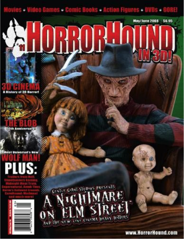
Masthead (Logo): The name of this magazine is called “HorroHound”. The design of the masthead is very eye catching due to its use of colours. They have used three colours out of lined giving it a 3d effect. The font is sans serif. Dateline: May/June 2008 - the dateline is placed on top of the masthead. Main Image: The main image of the cover Long shot of Freddy Krueger sitting in a old scruffy chair looking directly at the camera. Model Credit/Main Cover line: The main cover line for this issue of HorrorHound is “Gentle Giant Studio Present A Nightmare On Elm Street And The New Line Cinema Heavy Hitter” which is in a serif font in the colour white with red under glow and black shadow giving it a 3d effect. The cover line is making reference to the new film A Nightmare on Elm Street. Cover lines: The other cover lines for this issue are placed of the left hand side of the magazine. One of the cover lines is “3D cinema”, another is “The Blob” both these cover lines are in a sans serif font in the colour red and are very bold. Left Third: The left third of the magazine is what mainly grabs the audience attention. The left third for this magazine show the cover lines, barcode and a tiny bit of the logo and masthead. This could be a good thing for the magazine because it shows the variety of topics the magazine explores. Barcode: The barcode is placed in the left third of the magazine and is standard barcode that retailers use. Selling Line: This magazine does not have selling point therefore is either not popular or the editor/producer didn’t know the features of a magazine. |
|
