
IN WHAT WAYS DOES YOUR MEDIA PRODUCTION USE, DEVELOP OR CHALLENGE FORMS & CONVENTIONS OF REAL MEDIA PRODUCTS?
INTRODUCTION
Conventions and forms are rules that help to define that a trailer is an actually trailer not a different media product like a soap opera. These conventions helps the audience to recognise what type of media product it is and whether they want to consume it or not.
Conventions can either be used, develop or challenged - To use a conventions means to practice expected rules in the media product this may including things like using a barcode, logo , release date etc. To develop a conventions means slight changes have been made to pre-existing conventions. And to challenge means to completely go against the conventions.
To answer this question, I'll be comparing a lot to real text media especially J horrors to our media products. I will also be defining the conventions and what the use of them is and finally why we decide to either, use, develop or challenge the convention.
POSTER
|
|
These are some of the different industry standard conventions of a film poster. |

MISE-EN-SCENE
Denotation: The poster subject is a black and white photograph of a female looking directly at the camera. The shot is an extreme close up focusing on the female's face. There is no background seen making the female stand out more and one of the main focuses for the audience. Around the female there is credits, release date, title, quotes, logo, website, social websites, tagline and actress and actors. The text is either red, white or grey.
Title: The title is serif font with each letter being equal spaced out expected the two "oo". The font and colour of the title makes it stand out and eye catching allowing a audience to clearly know what film poster their are looking at. The title is the biggest text on the page - it allows it to be seen from a far distance in case an interested audience can not see it.
Character: The character on the poster is the antagonist of the film.
Prop: There are no props seen.
Lighting: The lighting used is low key making the female sinister and scary, it also for the texts to stand out more. The low key lighting also makes it obvious to the audience that this poster is to adverts a horror film.
Non-Verbal Communication: The female in the photo has her mouth open indicating that she either letting out or scream to scary or is in pain. The female us also looking directing at the camera, however her pupils are not see making it scary because you don't know if she is "looking at you" and obvious that something has happened to her.
COMPARISON
To see if our poster has followed, developed or challenged the industry standard conventions I will be comparing it to two real media text. One will be the "The Grudge"- I decide to use this to compare because it was voted as the favourite in audience research, so this meant that this one of the posters we close look at when creating our poster so that we can achieve the look our target audience would like. The second real media text will be "Mirrors" due to the fact that it is a well know and popular J Horror film. The two poster differentiate from each other, style wise and the different conventions that are used.


This means that the convention was followed
|

This means that the convention was challenged
|

This means that the convention was developed
|
REAL MEDIA TEXT

The title on the poster is a indication to the interested audience on what film poster they are looking at. The font used for the film title is usually what the company would use for other media products ensuring continuity - this allows the audience to be able to think back to the film whenever they see that particular font.
Both these two titles are in the shade of red and are short and snappy. However, one title is sans serif while the other is just serif and both are placed in different positions on the poster. 
Out of the two, only "The Grudge" poster had a tagline. Just the title the tagline is short and memorable making easily remember able to the audience. The tagline is meant to work in the same way as cheesy, snappy TV jiggle that you can't get out your head. When you hear the first few notes you already know what the advertisement is for like when you see or hear the tagline you already know what movie they are talking about. The tagline is usually placed at the bottom of the poster just under the title.


The credits are typically found at the bottom of the poster in colour white, written using a small font. The credits give acknowledgement to people who have contributed and have been involved in the process of making the film. Although, tiny the font is still readable allowing people to read it and see if people there know participated with the production making them more likely to watch the film and enlarging the audience.


Just like the credits, adding the an actors and/or actress name on the poster increasing the ticket sales as people tend to watch thing they "favourite" actor and/or actress is featured in.
The star's names have been placed, so that you can still see it but it doesn't take up too much attention. 

The release date is an important convention, it tells the audience when they can expect to see the film out. The release date in all genre of film placed it at the bottom of the poster just under the credit. The release date can either be "coming soon" or the actual date the film is coming out on.


The website is where the audience can interact with the film as well as finding out more information and products making them more likely to go and watch the film. The website address is one of the smallest thing you will find on the poster


The logo of the companies establish who has some involvement into the distribution and production of the film. This can increase ticket sales because a person may already know that company have involvement in good movies - so they would want to watch this. The logo is placed at the bottom of the poster and is very small but still notice especially if the logo is recognisable and popular.

The rating is something that tells the audience who can watch the film. It can be both good and bad due to the fact that people may want to watch the film but they are not of the age that the film rating is. The good thing about the rating is that it tells people what kind of things that can expect like "Violence" , "hard language". Plus when it comes to horror film certain people only want to watch one of a certain rating because it can determine how scary the film will be.


The subject/imagery is another one of the main conventions, it's the first thing the audience see when they look at the poster meaning that it has to be eye catching. The subject/imagery can either be of the protagonist and/or antagonist. It can also determine if the an audience want to watch the film or not.
|
OUR POSTER
For our poster we have decided to use a serif font and the colour red. We had to ensure that the title was eye catching so that it draw people into the poster/film and it would be easy to remember.

For our poster we decide to have a short and memorable sentence just like the RMT. Unlike the other poster we have put our tagline at the top because that is where we felt it would be most effect and we didn't want the poster to be bottom heavy
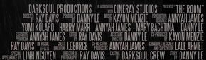
For our credits, we decided to use a small white font. We also put our credits at the bottom of the poster. The credits mention the key people who was involved when we was making the trailer this could be acting, operating the camera etc.

We decide that we would mention all four of our main actor and actress on our poster. This so that poster would look more "full" and this could increase the interest in the movie because there is a one in four chance that the audience would know at least one of the people starring in the movie.

For our poster we have used both a date and the words "coming soon". We done this because we felt it would make the audience more anticipated and excited to watch the film.

We have also placed our website underneath the credits and made it white like the RMT. We felt that it was important that audience could have some means of finding out more of the movie .

We also placed our logo at the bottom of our poster. We made them small because we didn't think they were important enough to be part of the key feature of our poster.

We include a rating a the bottom of the poster underneath the credits because, we felt that it would reflect to certain audience how scary the film is therefore gaining they interest in the movie plus it's a common convention used in different genre. The rating was made tiny because it is not a key feature for the poster.

We have used our antagonist for the subject as we felt it is a common property of a J horror poster. Only half her face is seen and she takes up half the page which felt was another common feature in J horror.
|
FOLLOWED? DEVELOPED? OR CHALLENGED?
Mainly, we have followed this conventions due to the importance it has on a poster. The fact that just like the RMT our title is short, snappy and red. We have even put our title at the bottom of the screen like the "mirrors" poster.

We have followed this convention due to effect it can have on a audience.

We have followed this convention. This because no matter what genre you look at there will be credits. In addition it could help to be increase "ticket sales" because people would be recognised.

We developed this convention as instead of mention just one of the stars that will feature in our film we had named all four main ones. We done this so that the full can gain more interest from fans that are deciated to stars. Therefore increase our ticket sells.
We have also developed this convention because we have used both "coming soon" and a release date. We know that it wouldn't make a big different but it was something unique that we haven't found in poster of our genre.

We followed the convention because technology is main interest of today's society. So that means you have to capture an audience attention in more than one way to ensure their interest in your product. We also felt that it would be important for our audience to be able to "interactive" with our film so that we could increase they interest in out movie.

We followed this convention because we knew that we need to include it within our poster due to people interest in companies.

We have followed this convention because we felt that it was imporant for interested audience to know what age rating the film is.

We followed this convention because we felt that this make it understandable to people what type of horror this is. We also followed this convention because the photo is the main focus on the poster, so if that bit was "messed up" and relatable to the film people would not want to watch the film.
|


|
We didn't add the directors name on the poster unless it was in the credits this because it was not an exterme popular convention on J horror poster but it is frequently used. Another reason why we didn't do this was because we felt that people in today society care more about the stars within the film than the people who directed the film.
|

This is a convention that we defintely "challenged".
|
These are some conventions that we didn't find or not commonly used in any in J horror poster but we still include in ours.

We add social website for the same reason why we added an website. It allows the audience to interactive and find out more things about the fillm which would make them more likely to watch the film.
|

We felt that by adding a pull quote in would make people more likely to watch the film because it's got a review from a well know reviewer.
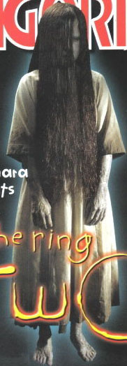
The image below is one from a RMT "The Ring" this example of a J horror poster using an pull quotes. "The Ring" have done this for both the poster adversting the movie and one for advertsting the DVD.
|


MAGAZINE
|
|
These are the different industry strandard conventions. |

MISE-EN-SCENE
Denotation: The magazine subject is a close up coloured photograph the antagonist female focusing mainly on the subject face and upper body.There is no background making the female stand out more and one of the main focus for the audience. Behind the females head is the "phantom" coverline while infrone and around there are coverlines - these coverlines are either black white or red. Around the female there are also date line, prices, coverlines, bar code and QR Code.
Masthead: The Phantom magazine is bold and big in the colour dark red and has holes and crackes in each letter giving the effect of worn out. The font used is a sans serif one and after each letter there is a gap. In where there should be hole in ther letter "A", "N", "O" and "M" there are hand gestures - it's puts a unquie twist on the masthead and makes it's stand out from other magazine it also add to the horror feel the magazine has going on due to the fact that it is a horror magazine.
Character: The character on the poster is the antagonist of the film.
Composition: You can not see much of a pose on the female but you can tell that her head is titled forward.
Prop: There is no prop on this magazine cover
Lighting: A low key lighting has been used to take this photograph making the female look evil and scary. The low key lighting implies the fact that this is a horror magazine because you would't expected a bright image.
Costume: Not a lot of the costume on the character is seen but from what is seen you can that it is something white.
Non-Verbal Communication: You can only see the female eyes which is scary one because it not's not natural - it look clouded over. Because the female is staring right at the camera it makes it seems that she is looking straight at you making the image/magazine scary. it's obvious from the lack of feature shown and the non verbal communication that this a bad character.
Coverlines: The main coverline relates to the phototgraph " THE ROOM. DO YOU KNOW FEAR?" The coverline is about a new film coming out - the question asked relates back to the film tagline "You don't know fear". By asking this question it implies that the readers haven't really been scared by anything until they watch this film. The are other coverlines display that within the magazine there will be mentions or talks with other films, interviews and an chart list.
COMPARISON
To see if our magazine has followed, developed or challenged the conventions of a horror magazine. I will be comparing it to three real media text. One will be Fangoria - I have picked this magazine because it the only one I could find that focuses on J horror. The second one is Horror Hound - this was chosen because it was voted favourite in our audience research. And the last one I have picked is Scream because the Fangoria magazine is quite an old, so I felt I should find something modern. Another reason why Scream was chosen was because it was the magazine we looked out when drafting.


RMTThe subject/imagery is one of the most important on horror magazine due to the fact that it would be one of the thing that the audience look at first meaning that it would have to be eye catching because it can influence an audience into buying the magazine. Most of the times horror magazine subject/image is the antagonist but it can also be protagonist.
The cover lines tell the audience what will be featured in the magazine before they buy it. They tend to be on the left third but they can also make appearance on the right side. Cover lines can be accompanied with pictures - these pictures can be what draws an audience into reading the cover lines in the first place.
The main cover line is usually the biggest thing on the cover after the masthead and would be bold and big making sure that it catch the attention of the audience. The main cover line would be talking about the main focus on the magazine that week/month. The main cover line would be placed at the bottom of the page and would be followed by a tag line explaining what be inside the magazine connecting with cover line.
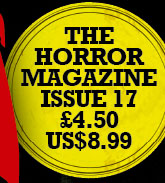
The three conventions displayed here is the date line telling the audience when the magazine was release. The issue number which indicates to the audience how many before this was released and the price telling the audience how much the magazine is. Out of the three the price would be the most important because the price would have the most influence on if someone would buy the magazine or not depending on the price of the product. These three conventions are usually small placed either at the top of the magazine or the bottom.
The website is were the audience can interactive with the magazine. There also able to find out extra things about stuff featured in the magazine and the magazine itself. Because of technology way of living it is important to have diverse way of reaching the audience.
The barcode is what every magazine have at the bottom of the cover. It allows the audience to actually buy the magazine. The barcode can sometimes include text like the date and/or price.
The selling line makes the magazine more appealing to interested audience because it tells the potential audience why people buy the magazine. The selling line is usually place somewhere around the masthead, most times underneath and is written using a small font.
The masthead is the most important convention. Every magazine has one and it placed at the top of the page and is big and bold so that it can be see from far away and draws attention to the magazine making people looks to see if the magazine is something they are interested in buying. It is also the biggest text on the magazine.

The strap line works in the same way as the selling works but instead it talks more about what will be featured in the magazine.
The QR code is something that we would extremely relevant in today society due to the gadget that people have today. The QR code allows for the audience to scan for additional features making them interactive with magazine.
This is not a popular convention in horror magazine. |
OUR MAGAZINE
We put our antagonist as the subject/imagery as we felt that it would be most effective in catching the audience attention as well as setting the mood for reading a horror magazine. The photo is was taken using a low key lighting because it would make our antagonist look dark and scary. Our subject is placed in front of the our masthead.

We decide that our cover lines would be placed on both sides. We done this because it gave us more option to show and interest the audience on why they should buy our magazine.

Our main cover line is second biggest text on the cover meaning that it would a draw attention to itself. We have also placed it at the bottom of the cover and include a tag line in a form of a question. Making the tag line a question draw in the attention of the audience because they would want to find out the "answer" of the question.

We decide that our date line, issue number and price would be placed on one line at the bottom of the screen. This is so an audience can easily find it.

We placed the two websites at the bottom of the page in a noticeable place. We include the websites because it would be a way to increase sales .

We placed our barcode at the bottom right hand side of the cover and is at an right angle. We didn't include any text on our barcode.

We placed our selling line underneath our masthead. This would mean that after looking at the eye catching mast head, people would influenced buy our selling line that tells people that our magazine in the best-selling one in the country for over a decade which would make them want to buy it more.

The masthead is what makes each magazine unique, I feel that our magazine has achieved this. The masthead is the biggest thing on our cover and draws a lot of attention to our magazine which would help to boost sells.

We have included a QR code and placed it above the barcode making it visible but doesn't draw too much attention to itself taking the focus away from the other main features.
|
FOLLOWED? DEVELOPED? OR CHALLENGED?
We have followed this conventions because we that it held to much importance to a magazine.

Although not show in the example provided we know that our magazine follows the rules of the cover lines. What makes our cover lines different from other is the different fonts we used to present them as well how much of the cover they take up. Here are two examples on magazine that present cover lines on both sides.

We have followed this convention because we felt it was important that audience should know the most important feature of our magazine that month/week. What makes our different is the fact that our tagline is a question - this is not something you seen often making our magazine different.

We followed these conventions because we felt that the magazine would not be complete without it due to the fact that so many magazine do use these three conventions.

This was another convention that we followed because we knew how importance it was to able to interactive with out audience.

We have also followed this convention due to the fact that every magazine includes one no matter the genre this shows the importance of this convention. Our text is at an ninety degree angle making it quite unique to other magazine because not a lot of them do this.

We followed this convention. We made this different by saying "for a decade" instead of just "best selling" this implies that we have consistent in magazine which makes people want to buy it over and over again.

We followed this convention because this another convention that all magazine have - so we felt that it would essential to include . What makes our different from other magazine is the "font" we have it's not one you see on other magazines.

We challenged this convention because we felt that the selling line already achieve the same thing as strap line does. Magazine often either use the strap line or selling line but not both - the selling line is usually favoured more.
|


TRAILER
REAL TEXT MEDIA |
|
|
|
|
CAPTIONS
|
The Ju-on: The Grudge has eight captions.
All the captions expected one are placed on a plain black background, written with white text. The one that is not is placed on a plain white background, written with red text. |
The Grudge also had eight captions.
All the captions expect two are placed on a white and blue flowing background, written with black text. One caption is placed on black, blue and white background with the text being written in white and another caption has a plain black background with the text been written in glow/neon blue. |
The Room has nine captions.
The captions have been placed on scratched grey background that has faded out so the edges are black. The text is written in white. |

I feel that we have followed the conventions of captions in the teaser trailer due to our small number of captions and having a simple background with white text.
EDITING
|
In 'The Grudge' the establishing shot is house in which everything takes place. Establishing shot usually sets the mood of the scene.
This slow cut is used at the beginning of the trailer just like the establishing it has the task of setting the mood for the beginning of the trailer. The slow cut also helps to start the slow pace of the trailer.
The fast cuts have been used twice in 'The Grudge' trailer. The fast cuts help to speed up the pace of the trailer as well excitement. The first fast cut it used at the beginning of the trailer about 26 seconds and then it slowly down to be picked back up at 48 seconds. They last about 3-5 seconds each.
|
In our trailer 'The Room' the establishing shot is a panning shot of the college. The college is also were everything takes place.
In our trailer, we have used the slow cut to set a slow pace for the beginning of the trailer.
Our fast cut scene starts at about 44 seconds, last for 5 seconds and has about 8 different cuts.
|

We followed this convention because we felt it will effective set the mood for the beginning of the trailer which is calm.

We followed this convention because it will help to develop tension and suspense in the trailer. This is what our audience voted for in our audience research.

This is a convention we followed. We used it because getting an audience excited means there are more likely to watch the film.
|
SUB-GENRE
COSTUME
REAL TEXT MEDIA


|
|
Both 'The Grudge' & 'The Ring' have a female antagonist that have long black hair, a long white dress and are very pale. Often times their hair cover the antagonist face.

|
|


This is a convention we have developed, we stuck with the female antagonist wearing along white dress, having pale skin and long black hair but we have made changes to the eye. We have our antagonist put it in contact lens to make the whole eye scary. We also surrounded the eyes with black make up emphasising the white eye.
ICONIC SCENE
|
|
|

We followed this convention because we felt that it important part of J horror. In scene the antagonist is seen in the mirror while protagonist is looking away. The scene is very short. We made ours different by making our protagonist looking at the mirror at the beginning before turning around and having the antagonist appear for a split second as the reflection of the protagonist where as in the RMT, the antagonist is seen throughout the whole clip and protagonist doesn't look at the mirror once.
|
TODOROV THEORY

Equilibrium: Two friends are bored at home and start discussing the a supposedly cursed video tape which apparently who ever watch the video gets a phone call and then die 7 days later.
Disequilibrium: One of the friends reveal that she has watched the video tape, after a while she dies and the other friend is left to investigate her death. They watch the tape and then start to have experiencing nose bleeds, nightmares and surreal situation.
Resolutions: The original tape is destroyed but they is still a copy which will continue the cycle of death

Equilibrium: The students are starting a new term of school. The teacher have wiped the slate clean behaviour, attitude and attendance wise.
Disequilibrium: The headteacher call 30 students into "the room", of these 30 students only 4 remain at the end. When the Yurie makes an appearance all hell seems to break lose. The students ultimately fight for their survival.
Resolutions: Although not show in our trailer, the resolution will be that Yurie defeats and kills the students just like the last two years and the cycle of "The room" continue.
SETTING

Most J horror movie, just like the grudge are set in a house.
|

Our trailer takes part in a college. We done this because we felt it would be gather a wider audience i.e students that go college.
|

This is a convention that we challenged because we wanted one aspect of our trailer to be different compare to a normal J horror.
|
WEBSITES & SOCIAL NETWORKS

With technology being a main part of society now day, companies are trying new ways to approach and engage their audience. One of these way is to make a website where they are features like downloads, image gallery, notes and behind the scene.
Click on the picture to go to the site.
Click on the picture to go to the site.

Our way of doing this is Weebly. On this website we can publish images, videos this would be our way to interactive with our audience if we was producing a full film.
Click on the picture to go to the site.
Click on the picture to go to the site.
|
|
|
We also created a Youtube and Twitter Page.
Youtube would of be used to upload trailer, behind the scene and snippets just like any other film company whereas, Twitter would have be used more a form a interaction with the fans as well announcing products.
Youtube would of be used to upload trailer, behind the scene and snippets just like any other film company whereas, Twitter would have be used more a form a interaction with the fans as well announcing products.
CONCLUSION
In conclusion, we have followed the majority of the conventions making it realistic and recognisable to the audience. However, we have also develop and challenged some conventions make our products unique and different to other out there.
I feel that if we didn't follow many of the conventions the products we produced, people wouldn't be able to tell what products are without being told.
I feel that if we didn't follow many of the conventions the products we produced, people wouldn't be able to tell what products are without being told.
