
INTRODUCTION
In this stage of Pre-Production, I will be coming up with some ideas for our magazine and Poster. This will be achieved by looking at existing posters and magazine, so that I can get some ideas and to ensure I include all the key conventions. From these magazines and posters, I will draw out some ideas before interpreting them into Photoshop and then finally, creating a rough mock-up.
EXISTING - POSTERS & MAGAZINES
The slide show below shows the magazine and posters that I liked and key feature which I hope to include in my own style to our poster/magazine.
|
|
|
DRAFT - POSTERS & MAGAZINES
Below are my drawn draft - these draft were a mixture of my own ideas, ideas suggest from my team and existing real media text that I found. Each draft has it's on unique feature but they all center around the Yurei. I personally think that I should of spent time colouring in the drafts, so that I could get a better rough understanding on how each one would look as final outcome. Other than that I think I used a good amount of different camera shot, conventions and compositions/layout in each draft. The hardest thing to do while doing the drafts other than drawing it was coming out with poses for the Yurei due to the fact that our group have a set mind on our how our Yurei should be shown to the audience.


DRAFT - PHOTOSHOP POSTERS


|
The trouble with creating this poster was finding the right image and then creating a realistic room that look dark and dreary. I think that outcome was quite successful however I do think a better effect is needed for the "starched" writing on the wall. The draft maybe been even better without the bulb but I wanted to keep it as close as the drawn draft - so that we get a real idea on how certain things work together.
|
This is one of my favourite draft, I think that everything works out perfectly together. The problem with this draft was whether to keep the chair or not - I wasn't sure if they looked random or not but after asking some peoples opinions after telling them synopsis they said I should keep it. Another problem that I had with all the posters and not just not this one was creating credits that look realistic - the problem I had with this was getting the font size right, the alignment and what text to put.
|
I also liked how this poster turned out. The image I found on line worked perfectly for what I drew in the draft. It was quite hard to get a rusty metal effect sign on the door - but after watching some Youtube tutorials I got a idea on how to do it however I don't think that the idea of rusty came across. I think when creating all poster I should of thought about adding an age rating because it would of looked more realistic and would of gave us a better understanding on how our poster should look.
|
I think out of all the drafts this was my favourite one just because everything works perfectly. The hardest bit for this draft was creating the room which I achieved by the warp mode and black lines. I also used the warp mode to for the floor. My favourite part of this poster is the title which I downloaded from the internet. The shadow effect on this title was created by duplicating the text layer, changing the colour to black and then moving the layer slightly to the right.
|
DRAFT - PHOTOSHOP MAGAZINES


|
The difficult with making this magazine was getting a image that was like the one I drew in the draft. And the position everything as well as making sure the magazine didn't look to plain but because of the skills I gained last year making my own magazine - I was able to overcome the difficult and make this magazine. I think this was one of the less successful magazine just because I don't think everything work together as well as it should. The masthead font & issue number was downloaded. The background was created using a gradient and the film strip was made using shapes in Photoshop.
|
This was one of my favourite draft just because of the "ripped metal" that include in the drawn worked out just how I imagined. I also like how the masthead turn out, although it not exactly how I imagined it - I still feel that it has a ghostly feel. I learnt how to do the masthead through watching a Youtube tutorial. I also liked how the main cover line worked out - with a "logo" and metal writing for "the room" which was achieved through using a clipping mask. On the other hand, I think that I should of spread the cover line out more because in reality they wouldn't be that close.
|
With this draft, I liked how the masthead worked and the layout of the conventions. The background was made by using a black and white gradient.
However, I believe that the image used could of been better because this one doesn't as well as hope it would due to the fact that the image is slightly grey which is the main colour scheme of this draft. |
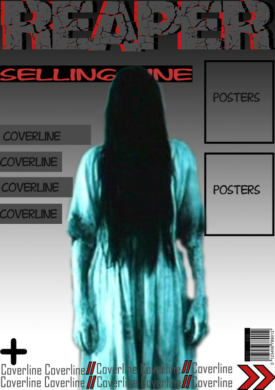
This logo and masthead for this draft worked just like I imagined. The blood dripping within the text was created using a clipping mask - which was taught to me through watching a Youtube tutorial. I believe where the cover lines are placed work really well however the magazine still looks empty.
|
DRAFT - PHOTOGRAPHS
|
|
Here are some photographs we took to get a rough idea on how (if we keep the Yurei as the main image) we want the villain to pose, the lighting, camera angle as well as the ISO,aperture and shutter speed. We used two different models to see who would look better, I found that are second model worked better for what we have in mind. Majorities of the photographs turned out well however, I feel that I should of messed around more with camera angles and zooming in . As well as telling the model to change her facial expression.
The best shot(s) was 13 -15 & 19 - 20 These are examples of how our potential images may look like. The worst shot(s) was 7 & 9 These are perfect examples of what to avoid when take our next set of photos. |
FINAL MOCK UP POSTER
|
|
After taking the photographs - so that we could get a better view and understanding on how everything looks and works together - I put one of the photos (21) into one of the mock posters. I think that it worked excellent. Although, I had to move the title so that it wasn't covering the "Yurei's" eye.
On both posters photographs, I've added a black gradient, changed the brightness and contrast and change the colour of the "Yurei" eye. On both magazine photographs, I've changed the brightness and contrast and added a black gradient however for each photo I put and dragged the gradient in different place which made change the final outcome. |
